Week 1
Topics covered this week include:
- Setting up an online portfolio (coroflot.com)
- Raster vs. vector graphics
- Adobe Illustrator vs. Photoshop
- Adobe Illustrator interface
- Saving your work
- Basic shape construction
- Drawing shapes with the Pen Tool
- Copying & pasting
- Zooming & panning
- Shape depth reordering
- Basic transforms (rotation and scale)
- Stroking & filling geometry
- Changing stroke width
- Anchor point manipulation using the Direct Select tool
- Undoing
- Saving your work for viewing online
- Accessing help (F1)
Lab 1
Title: Building an online portfolio
Introduction: This assignment will allow you to set up an online portfolio that you will use to submit your assignments this quarter. In the long-term, your portfolio will serve as a repository for your best work to show potential employers.
Tasks: Go to coroflot.com and sign up for a free online portfolio. In the Edit Profile section, specify your Personal URL and submit this name to your instructor. Fill in all personal information in this section. Specify additional information as "Print." In the Overview section, talk a little bit about what you currently do and what you are aspiring to do in the future. Keep it short and sweet. Have a close friend or family member proof your portfolio for proper spelling, grammar and punctuation.
While building your portfolio you will be working in the following parts of Coroflot:
- View Profile button (upper right corner) - Allows you to see what you portfolio will look like to others.
- Edit Profile - Allows you to set up personal information. Additionally, you should choose which three images will have a prominent display on your home page (Featured Work tab)
- Upload Work - Allows you to upload images to your portfolio and to specify what sets (folders) they will be stored in. For this quarter I would like you to create the following sets: VC100 Week 1 through VC100 Week 10 (therefore, there will be 10 folders you will create throughout the quarter). At the end of the quarter you may get rid of these folders and store your best work in folders that are more appropriate for your portfolio (i.e. Photoshop Projects).
- Edit Work - Allows you to re-arrange the order of your sets (only the top four sets are viewable from the home page). You can also delete images within a set and move images between sets.
- View All Work - See which of your images is getting the most views.
- Statistics - Gives you a monthly breakdown of traffic to your portfolio.
Your homework for Lab 2 must be uploaded into the VC100-Week 1 set (folder) by next week.
Due Date: Next week.
Lab 2
Title: Illustrated Wall-E
Introduction: This assignment will help you to apply the basic Illustrator drawing fundamentals as discussed in lab. These include: basic shape construction, copy and pasting, anchor point manipulation, basic transformations (moving, scaling, and rotation), geometry stacking and stroke and fill color manipulation.
Tasks: Your assignment is to trace the front view of the iconic Pixar character Wall-E using the file linked here. In this file I have provided a base image from which you will construct your illustration. When it is time to save this image to view on the Internet you should turn the bottom layer (the one containing the picture of Wall-E) off by clicking on the eye-ball to the left of the layer name in the Layer Palette (F7). I have provided addition research imagery here for you to get some additional information about what this character looks like. NOTE: You will not be drawing the arms in the same position as they are in the base image as they are depicted three-dimensionally instead of two-dimensionally. Look at the research images to get a sense of what the arms would look like at Wall-E's side or held upright. The ability to interpret a 3D image and convert it to a 2D image (or vice versa) is a very important skill that all artists and designers must develop. I have already drawn the eye-mount portion of Wall-E's head as this is a shape that is not possible to construction from simple geometric shapes. I used the Pen Tool to draw this shape (which we will learn how to use in a few weeks). As this will be an illustration, your version of Wall-E will look more cartoony than realistic (as depicted below).

NOTE: By the end of the week I will have a rendition of Wall-E constructed in Illustrator for you to look at.
Requirements: This illustration will be constructed from BASIC GEOMETRIC SHAPES AND LINES as discussed in class this week. While the use of the Pen Tool is permitted, you can only use it for constructing shapes comprised of straight lines. Early in your education it is imperative to understand that all artists and designers must learn to work within constraints. Planning what tools you are going to use is very important when using digital imaging software. As you can see, most of this drawing can be completed from overlapping rectangles, rounded-corner rectangles, shapes comprised of straight lines and circles. This planning (or lack thereof) will prove to be the most challenging part of this assignment.
I have compiled some helpful tips below to aid in the construction of Wall-E:
- Drag your Layer Palette to the top of the palette dock and stretch it out using the gripper in the lower right corner. This will allow you to see all of the shapes that comprise your image. Clicking on the right-facing arrow on Layer 1 will allow you to see all of the shapes you have constructed and give you the ability to re-order them.
- While much of this project will be constructed using the Pen Tool, there will be times where you might need to manipulate the anchor points (where you clicked when drawing the shaped) of the shapes you constructed. Anchor points can be moved with the Direct Select Tool (A) (the white arrow found in the tools palette). NOTE: If after selecting an anchor point, the entire shape moves, this happens because all of the anchor points have been selected (each anchor is filled in blue). To solve this problem, unselect the shape by clicking anywhere in empty space. Select the shape again but this time on one of the edges. All of the anchor points will be filled in white (unselected). Now select the anchor point you wish to relocate and it will appear blue. If you want to move multiple anchor points simultaneously then hold down the shift key while selecting.
- I would recommend using very few stroked shapes, in this exercise instead relying only on fill color.
- Zooming into the image (alt+rolling the middle mouse wheel) will help you to accurately construct the more fine detail like the treads and Wall-E logo.
- Alt+drag shapes to copy them instead of drawing them again. You may find it helpful to group multiple shapes together before moving, rotating or scaling them. To copy geometry vertically or horizontally be sure to hold down the shift key also so that everything lines up neatly.
- Take advantage of the ordering of paths on layers to draw shapes in front of or behind other shapes. For example, the shape connecting both eyes should reside below the shape sub-layer where the two eye shapes reside.
- I suggest you don't fill any of the shapes with color until after you have completed the construction of Wall-E. This is because filling shapes will obscure the image below. When the time comes to fill each shape with color, use the Eyedropper Tool to extract color from the base image. If you want to do all your eye-dropping at once, you can drag the fill color chip to the Swatches Palette for later use. Obviously, we will not be able to get the "grungy detail" of his chassis and treads. Drawing a more realistic rendition of this character would require the use of programs such as Photoshop or a 3D modeling program such as 3dsmax.
- I would definitely encourage you to construct the Wall-E logo on his chassis. To get the rounded corners you will need to construct the horizontal bar at the top of the A, bottom of the W and top and bottom of the E from a rounded-corner rectangle. Deleting a few anchor points with the Direct Select tool will allow you to construct a shape with one or two rounded corners.
- It is not necessary to draw the yellow bulb symbol on his chest as the technique required for its construction will not be discussed until next week. You do not have to create the Disney Pixar logo at the bottom.
Extra Credit: Some ideas for extra credit include: drawing his arms in 3D (as depicted in the image above), adding in landscape and scenery, drawing Eva besides Wall-E.
Saving: When your robot is complete save your Illustrator file (File > Save) as well as a .JPG (File > Save For Web and Devices). You should then upload your .JPG version of your robot to your Coroflot portfolio as demonstrated in class. As a general rule you should be saving your Illustrator file every 15 minutes (don't write over the previous version, but append the file name with an incremented letter or number e.g. robot1, robot2, robot3... etc.). Be sure to make a backup copy of all your work. DO NOT SAVE YOUR ONLY COPY OF YOUR WORK ON THE SCHOOL COMPUTER AS THESE PROFILES WILL BE PERIODICALLY DELETED TO IMPROVE SYSTEM PERFORMANCE AND TO REIMAGE OUR LAB. THIS MAY HAPPEN WITHOUT WARNING.
NOTE: If you are struggling with this assignment contact a classmate and ask them if they have some time to sit down and help you. Don't have them do the assignment for you! It is always best to have classmates help you first as they will be your lifeline throughout your education. Additional tutoring can be obtained by contacting my lab assistant. You instructor is available to help you if you have exhausted the first two resources.
Important hotkeys for this week:
- F7 Layer palette toggle
- Space bar - pan image
- Alt+roll middle mouse wheel - zoom in and out
- (Ctrl+=) - zoom in
- (Ctrl+-) - zoom out
- Ctrl+0 - zoom 100%
- Ctrl+1 - zoom to fit artboard
- Ctrl+z - undo
- Delete - deletes currently selected geometry
- V - select tool
- A - direct select tool (used to move anchor points)
- P - pen tool
- D - restore to default colors (white fill, black stroke)
- Alt+ drag (using select tool) - copies selected geometry
Featured student work:
- http://www.coroflot.com/public/individual_file.asp?individual_id=272775&portfolio_id=2468946&school=ITT+Technical+Institute&state=45&c=1
- http://www.coroflot.com/public/individual_file.asp?individual_id=272771&portfolio_id=2482177&school=ITT+Technical+Institute&state=45&c=1
- http://www.coroflot.com/public/individual_file.asp?individual_id=272772&portfolio_id=2506008&school=ITT+Technical+Institute&state=45&c=1
Basic Drawing resources:
- http://www.layersmagazine.com/adobe-illustrator-drawing-tools-part-1.html - Beginning drawing video pt. 1. NOTE: This video was created using the Mac version of Illustrator. See shortcut key difference between PC and Mac below.
- http://www.layersmagazine.com/adobe-illustrator-drawing-tools-part-2.html - Beginning drawing video pt. 1.
- http://www.nobledesktop.com/shortcuts-illustratorcs3-mac.html - Mac hotkey list for Illustrator CS3
- http://www.nobledesktop.com/shortcuts-illustratorcs3-pc.html - PC hotkey list for Illustrator CS3
Week 2
Topics covered this week include:
- Precision drawing of all drawing tools discussed last week
- Precision transformation (move, copy, rotation, scale)
- Repeat transformation (Ctrl+D)
- Guides
- Smart guides (Ctrl+U)
- Grid
- Align and distribute
- Type tool (T)
- Character and paragraph palette (Ctrl+T)
Lab 1
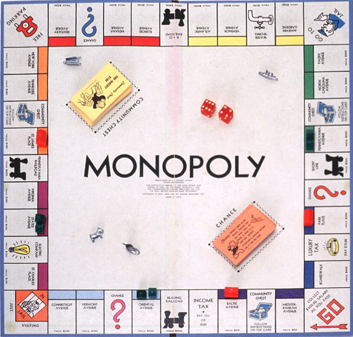
Title: Foundations of a Monopoly board
Introduction: This assignment will help you learn precision drawing and transformation techniques with a basic introduction to using type in Illustrator. The symbols (e.g. chest, faucet, train etc.) will be added during another week. Other things not drawn this week include: the pieces, the community chest and chance cards (though you will draw the spot for these cards) and the dice. As precision drawing and transforming is the theme of this project AT NO TIME SHOULD YOU EVER BE EYEBALLING THE SIZE OR PLACEMENT OF AN ELEMENT OF THIS PROJECT! A little arrow key nudging is permissible for locating type objects as type doesn't work well with snapping using Smart Guides.
Tasks:
- Download this Monopoly board. Right click on this image and select "Copy". Go into Illustrator, create a new document (set your units to inches) and paste it (Ctrl+V). Go to the Layer Palette (F7) and lock this layer. Create a new layer (the icon to the left of the trash can in the Layer Palette). You will be drawing the board on this new layer.
- The key to drawing this board accurately is to establish the proper size for a single property rectangle (e.g. Connecticut Avenue). You will NOT be doing this by eyeballing the size of the rectangle. Instead, you need to place your cursor in the bottom-left corner of a property (Connecticut Avenue) then single-click while you have the Rectangle Tool selected. A dialog box will appear. Type in an arbitrary value in decimal inches. Obviously, you will not get the size correct the first time. Delete this rectangle and repeat this process changing the values in tenths of an inch (e.g. 2.1, 2.2, 2.3... etc) until you get the exact size of this rectangle. Once you get this number write it down on a piece of paper as you will have to refer back to this number. The rectangle you are trying to get is the one that surrounds the colored box (i.e. the cyan box for Connecticut Avenue). We'll add the colored box in later. Temporarily turn off the fill color for this rectangle.
- Next, turn on your Smart Guides (Ctrl+U). With the Rectangle Tool, click in the upper-left corner of the rectangle you just created. Now, drag down and to the left to draw the rectangle surrounding the colored box. By using smart guides words will appear near your cursor indicating that you are connecting exactly to the geometry. Your first click will be at "Intersection" while you second will be at "Path".

- Next we are going to establish a center line in the rectangle we just drew. To do this we'll use guides. Turn on your rulers (Ctrl+R). From your vertical ruler on the left, drag a guide to the left side of the property rectangle (in this case Connecticut Avenue). Next, look at the width dimension you wrote down on the paper. Divide this number in half. If you need to, go to Start > Run (in windows) and type calc.exe. This will open the Windows calculator. Next, right click on the blue guide and select Transform --> Move. NOTE: If the transform option doesn't appear you either A) don't have the guide selected or B) The guide is locked and you will need to right-click on the guide and uncheck "Lock Guides". In the transform dialog type in a vertical value of 0 and a horizontal value equal to one-half the width of the property then click "Copy". This should duplicate your guide to the middle of Connecticut Avenue. If your guide didn't copy property try to transform it again and double check your measurements, units of measurement (inches) and make sure you put the non-zero value in the horizontal field.
- We will be centering our text for our property using this vertical guide as a reference point. Open the Type Palette (Ctrl+T). Select the Paragraph tab and set your text justification to Center (the icon is similar to what you might see in Word). This will assure that when you type your text it will expand from the center outward and make it easier to edit your text after you've duplicated it. Go back to the Character tab. For this exercise we'll use the default typeface Myriad. You'll probably find it easier during this next step to zoom in on Connecticut Avenue to place the type precisely. You may also want to drag a few horizontal guides from the top ruler to the bottom of the three text items in this property, "CONNECTICUT", "AVENUE" and "PRICE $120". Select the Type Tool (T) and click where the vertical guide meets the top horizontal guide (beneath Connecticut). Type the word "Connecticut". Your type size will not be correct at this time. If you Ctrl+click in an empty spot in the drawing this will allow you to place your last two pieces of type without exiting out of the Type Tool. Once you have got your three lines of type in place, select the words "Connecticut" and "Avenue" (by shift selecting) and in the Type Palette increase the type size until it somewhat matches the height in the raster image. NOTE: Since we are not using the same typeface as the original Monopoly board the width of each line of type will most likely not match the original. Notice how the word "PRICE" and the value of the property are not the same height. This doesn't mean that you have to use two different type objects. Instead, select the Type Tool (T); click in front or behind the word "PRICE" and drag over the word price (holding down the left mouse button). This will allow you to select part of a line of type and change an attribute of that type (in this case the height) without affecting the rest of the line.

- This is a good time to choose the appropriate stroke thickness and fill colors. You can use the Eyedropper Tool to get the exact color of the colored box from the game board raster image.

- Now that you have a completed property it is time to duplicate that property around the board. With the Select Tool (V) marquee select the card you just completed. Right-click and select Transform --> Move. In the vertical field type 0 and in the horizontal field type in the width of the property you wrote down. You should now have Vermont Avenue! To duplicate this transform press Ctrl+D seven more times. This will bring you to Mediterranean Avenue.

PLEASE NOTE: This Monopoly board image is not a top quality image. Your property boxes will not line up with the original image. You should notice that the property boxes deviate from the original around the 'INCOME TAX' property rectangle. This is ok! You have likely not made any mistakes.
- To construct the ‘Go’ square we are going to use Smart Guides and the Rectangle Tool. Select the Rectangle Tool and click in the top-right corner of Mediterranean Avenue (make sure that your Smart Guides display Intersection before you click). In the dialog box type the height of the property that you wrote down in both the width and height fields. You should now have the ‘Go’ square.

- At this point you should have the entire bottom row created. Take the time to delete the colored squares you don't need. Using the Type Tool (T) will allow you to update the names and prices of each property by dragging over each word and updating the text. You should now eye drop the colors of each property into the corresponding property boxes. Once you completed all of these steps your bottom row will be complete.

- To get the properties going up the right side of the board we will need to copy one of the existing properties, rotate it, and then use our smart guides to move it into place. This can be a little tricky. With the Select Tool marquee select Mediterranean Avenue. Holding down the Alt key drag this property to the right (this should duplicate the selection). Next, with the copy of Mediterranean Avenue still selected right-click and select Transform --> Rotate. In the rotation field type -90. This should rotate the property counter-clockwise. Here is the tricky part. To avoid eyeballing we need to align the bottom-right corner of our property to the top-right corner of the ‘Go’ square. The Select Tool won't work here because as soon as we grab the bottom-right corner and drag it will scale our selection! There are two ways around this problem. The first is to move the property in two steps using our Smart Guides. The way I like to do it is via the Direct Select Tool (A) (The white arrow). With the Direct Select tool you will no longer get the big transform boxes in the corners of the selection. Instead you will see the anchor points of the selection. Select the bottom-right anchor point of the property and drag it to the upper-right corner of the ‘Go’ square (this will be from the Intersection to Intersection as indicated by your Smart Guides).
- At this point you should have the right hand side of the board created. Take the time to delete the colored squares you don't need. Using the Type Tool (T) will allow you to update the names and prices of each property by dragging over each word and updating the text. You should now eye drop the colors of each property into the corresponding property boxes. Once you completed all of these steps your right hand row will be complete.

- You should now be able to repeat the past two steps to copy the properties across the top and left hand sides of the board. Remember to edit the text and color scheme of each property as you move across your board.

- To get the blue border around the outside draw a big square from the lower-left to the upper-right corner of the board (with fill turned off and stroke turned on). In the Stroke Palette (F10) select the "Apply stroke to outside" button and turn up the stroke thickness until if matches the thickness of the blue border. Eye drop the blue from the original board.

- The Chance and Community Chest rectangles (comprised of ‘?’ marks and dots) are tricky to draw accurately as the board is turned sideways. What I would do (to avoid having to draw at an angle) is to unlock your bottom Layer and Alt+drag a copy of the board way to the left or right of the board. Then, select this copy of the board, right-click and select Transform --> Rotate. Type 45 in the rotation field. This should rotate the copy of the board so that the Chance and Community Chest rectangles are not flush to the bottom of the screen. To draw this sequence of ‘?’ marks and dots accurately use the same technique that we used to draw the properties; get your first ‘?’ mark and circle in place then right-click Transform --> Move, experimenting with values until you get the right distance. To do this right you shouldn't be eyeballing anything!
- The next challenge will be locating the Chance and Community Chest piles equal distance along the center diagonal of the board. But first, we must locate one of the two piles along that diagonal center. To find the center of the board use the Line (or Pen) Tool and draw lines from both corners of the board, forming a big "X". The point at which the two lines cross is the center of the board. Select your newly created pile (comprised of dots and ‘?’ marks) and use Transform --> Rotate to rotate it 45 degrees. Next, drag this selection to its corresponding place on the board (in either corner).
- A neat trick for accurately locating the 2nd pile is to use the Rotate Tool (in the toolbox). Select the Rotate Tool and Alt+click at the point where the two diagonal lines cross (you will see the smart guides say Intersect). This will open the “Rotate” dialog box. Specify 180 degrees for your rotation angle and press "Copy". Your pile will duplicate itself on the opposite side of the board. This technique is what you would use to create petals on a flower, rays of light coming out of a sun, or arms on a snowflake (with varying angles of course).
- Using the Type Tool and center justification (in the Paragraph Palette) place the words "Monopoly", "Chance" and "Community Chest" along the diagonals. The latter two will have to be rotated after the fact.
- Delete the big X or move it to a new layer that is turned off.

Next week, you'll have the opportunity to construct the symbols on the board.
Important hotkeys for this week:
- Ctrl + c - copy
- Ctrl + f - paste in front
- Ctrl + v - paste in middle of screen
- Ctrl + x - cut
- Ctrl + d - Repeat transform
- Ctrl + t - Toggle Type tool
- F7 - Toggle Layers Palette
- Ctrl + r - Turn on rulers
- Ctrl + ; - Toggle guides
- Ctrl + u - Toggle smart guides
- V - Select tool
- M - Rectangle tool
- I - Eyedropper tool
- Shift + Ctrl + m - Move transform
Featured student work:
- http://www.coroflot.com/public/individual_file.asp?keywords=lori+worthen&c=1&portfolio_id=3201155&individual_id=302232
- http://www.coroflot.com/public/individual_file.asp?from_url=true&portfolio_id=3907492&individual_id=336027
- http://www.coroflot.com/public/individual_file.asp?from_url=true&individual_id=336008&portfolio_id=3890617&
- http://www.coroflot.com/public/individual_file.asp?from_url=true&individual_id=336008&portfolio_id=3892516&
Week 3
Topics covered this week include:
- Creating compound shapes using the Pathfinder Palette
- Manipulating anchor points and handles
- Adding and removing anchor points
- Basic color manipulation
- Outlining stoke (Object > Path > Outline Stroke)
- Rotating and reflecting
Lab 1
Title: Drawing pictograms
Introduction: A pictogram is a symbol representing a concept, object, activity, place or event by illustration. You will be using your knowledge of the Pathfinder to recreate (as accurately as possible) EIGHTEEN of the pictographs show below.
NOTE: Some of the pictograms below are FAR more difficult to draw than others. The ones with the water and organic shapes (gas pump hose) are going to be your more difficult ones. Challenge yourself.

Tasks: Learning how to draw compound shapes is often a very experimental process. You should spend considerable time experimenting with the affects of the adding, subtracting and intersecting geometric shapes with the Pathfinder Palette. A basic tutorial for the Pathfinder Palette can be found at http://www.vectorials.com/tutorials/Adobe-Illustrator-the-Pathfinder-Palette-65671.html.
Your limitations are as follows:
- You will be tracing from these symbols directly.
- Each object should be drawn on its own layer.
- As you are drawing each symbol, zoom as closely as possible to assure accuracy. You will find that working with Smart Guides and Guides will be extremely helpful.
- Each object will be comprised of multiple basic geometric shapes sculpted together into compound shapes using the Add, Subtract and Intersect shape modes of the Pathfinder Palette.
- You may use the Direct Select Tool to manipulate your original or expanded compound shapes into new forms.
- It may be necessary to add or subtract anchor points. The add and subtract anchor point tools can be found under the Pen Tool. However, you cannot use the Pen Tool on this assignment as it negates the purpose of the assignment. The point of this assignment is that it is sometimes slower to use the Pen Tool.
- Use the reflect tool on symmetrical shapes (e.g. bus, airplane).
- You must include the rounded-corner square and the colors from the original.
- While you only have to draw nine of the pictograms, you are encouraged to draw as many as you can.
- The more challenging of shapes you successfully draw, the higher your grade will be.
Presentation: At the conclusion of this assignment, all nine of these objects will be scaled down to like sizes and organized in 3 rows and 3 columns on an 8.5" x 11" page. As always, upload your image to Corflot.
Extra Credit Lab:
This week's extra credit is to develop new symbols that are stylistically similar. Each symbol should be the same size. Try to simplify the symbol as much as possible.
Office symbols:
- Pencil sharpener
- White out
- Tape dispenser
- Computer mouse
- Pencil
- Computer
- File folder
- Exit sign
- Clock
- Fire extinguisher
- Chair
- Stapler
- File cabinet
- Coffee maker
- Water cooler
Pathfinder resources:
- A basic tutorial on the potential of compound shapes - http://www.facebook.com/ext/share.php?sid=94136163503&h=PU1HH&u=9IXKy&ref=nf
- A video about the pathfinder palette - http://www.facebook.com/ext/share.php?sid=94136163503&h=PU1HH&u=9IXKy&ref=nf
- How the pathfinders resolve fill and stroke - http://www.facebook.com/ext/share.php?sid=94136163503&h=PU1HH&u=9IXKy&ref=nf
Due Date: Next week.
Important hotkeys for this week:
- None.
Featured student work:
- http://www.coroflot.com/public/individual_file.asp?from_url=true&individual_id=336018&portfolio_id=3929497&
- http://www.coroflot.com/public/individual_file.asp?from_url=true&individual_id=336018&portfolio_id=3930158& (extra credit)
Week 4
Topics covered this week include:
- Drawing paths with the Pen Tool
- Modifying paths with the Direct Select Tool and Convert Tool
Lab 1 (do not submit to coroflot)
Title: Pen tool fundamentals
Introduction: Using the Pen Tool effectively requires mastering a few basic techniques that, when chained together, allow you to create the most intricate of shapes. This tutorial will allow you to master these fundamental concepts for Pen Tool shape (path) construction.
Tasks: Go to http://vector.tutsplus.com/tools-tips/illustrators-pen-tool-the-comprehensive-guide/ and scroll to the bottom of the page (but above the comments). Here you will find a link to a file called Pen Tool Exercises. Download this file and open it in Illustrator. Your assignment is to use the Pen Tool to construct the word "VECTOR" use the step-by-step instructions of the tutorial. The following symbols are used in the tutorial:
- Orange circles represent starting points for each closed path
- Blue circles with X's are places you left-click.
- Smaller green circles with X's are places you let go of the left-mouse button after dragging.
It is not necessary to label your final construction. Upload the completed project to Coroflot.


Lab 2
Title: Logos
Introduction: This assignment will help you learn basic Pen Tool mastery through the tracing of logos for fictitious fantasy football teams as seen below. It is strongly recommended that you read the Illustrator packet entitled Drawing Paths before proceeding with this assignment. The Pen Tool is, by far, the most complicated (and frustrating to learn) feature of Illustrator. I also recommend the PDF reference I provided in the Pen Tool Resources section at the end of this week.
This week you are tasked with tracing six of the nine silhouettes for the fantasy football teams shown below. Each path should be as accurately as possible with the FEWEST number of anchor points. By silhouettes I'm referring to the white boundary line surrounding each logo (the red line in the case of the ram and the blue line in the case of the polar bear). You are encouraged to draw all nine silhouettes. Next week we will fill in the interior details and add color.

Tasks:
- Copy and paste the image above into Illustrator and lock this layer.
- Create a new layer for each logo. Name the layers based on the content (e.g. dalmatian, gavel, ram, etc.)
- I strongly suggest that you plan out your anchor point placement before you start drawing. Remember, you are shooting for the fewest number of anchor points that afford the highest amount of accuracy. Also recall that there are certain strategies you can use for anchor point placement: peaks and valleys or at points of tangency are two such methods. One way to reduce the number of anchor points is to use S-curves.
- As you draw, remember that you don't (and can't) get it perfect the first time. After you have traced around the shape, go back with the Direct Select tool and fix your mistakes by relocating anchor points and manipulating handles. Remember, every curved path segment must have a handle on both ends. If you use the Direct Select tool to select a path segment (as opposed to an anchor) remember the arrow key tricks I showed you in lab to lengthen and shorten the handles.
- As you draw, when you are going from a curved path into a straight path be sure to delete the handle for the new path by clicking again on the last drawn anchor point.
- If you are missing a handle on either end of a curved path use the Convert Tool to restore them. To break the connection between two in-line handles, select the handle with the Direct Select tool and Alt drag the handle. Once you have broken two in-line handles the only way to restore them is to use the Convert Tool.
- Most importantly, it is natural to struggle with the Pen Tool. Practice makes perfect.
Pen Tool Resources:
- Pen Tool video tutorial - http://www.youtube.com/watch?v=5DzpT8POAME
- Pen Tool instructional PDF - ai pen tool.pdf
- Pen Tool resources including shortcut keys and the forms the pen tool cursor takes on - http://vector.tutsplus.com/tools-tips/illustrators-pen-tool-the-comprehensive-guide/ (check out the great sample tutorials at the end)
Important hotkeys for this week:
- Coming soon.
Featured student work:
Week 5
Topics covered this week include:
- Advanced pen tool and convert tool techniques
- Outlining paths
- The divide pathfinder
Lab 1
Title: Logos
Duration: 2 weeks
Introduction: This week you will be completing the logos you outlined last week. All interior shapes will be created and eyedropped with their appropriate color. It is recommended that you complete all nine logos.
Tasks: This week is pretty straight forward as you will be drawing the interior features of each logo by stacking shapes on top of shapes. It is recommended that you use Object > Path > Offset Path to duplicate the silhouettes for each logo (use a negative offset value to offset inward). This will help maintain a uniform distance around the shapes. You can still add in or remove extra detail after you offset the path. NOTE: If you have reflect a symmetrical shape you will have to join BOTH sets of anchors before you offset path as it will produce undesirable results if you don't.
One thing you want to avoid is drawing one shape on top of another while tracing along a shared edge. By doing this, you will get uncomfortable overlaps. A better way to do this is with the divide pathfinder (bottom left tool in the pathfinder palette). For example, let’s take a look at the polar bear. Notice how the white and blue interior shapes rest on top of the black silhouette of the polar bear. If you draw the white shape on top of the blue shape or the blue shape on top of the white shape you will find that the shared edges between the white and blue shapes don’t properly align.

Instead, after you track the third silhouette from the outside (the one that follows the contours of the mouth), draw the pink path as seen below.

Next, create a dissecting line by drawing the pink path that appears below. Notice that the path you are drawing shares a border between both the white shape and the blue shape. You must extend the current path you are drawing outside of the shape you created in the previous step.

Next, select both the pink path and the orange path. Press the divide pathfinder icon and the lines extending outside of the orange shape will disappear.

You can now use the Group Selection tool (under the Direct Select tool) and fill the two new shapes in separately. As you can see, both shapes now share a common edge like two pieces of a jigsaw fitting together.

NOTE: The other place you should use this technique is on the white highlights on each of the horns of the ram.
Lab 2 - Extra Credit
Title: Fantasy football logo creation
Duration: 1 week
Introduction: As an extension to the fantasy football tracing exercise you are to create your own logo for a ficticious fantasy football team based on the animal of your choosing.
Steps:
- Identify an animal.
- Select a view. Some animals will be more recognizable for the front while others will be more recognizable from the profile (side). For example, a rhino will be more recognizable from the side while a guinea pig will be more recognizable from the front.
- Use google or bing image search to find a strong image from the view you have selected.
- Print that image out on the color printer.
- Use a pencil to delinate areas of color or value change.
- Use the scanner to scan the sketch. Save the sketch as a .JPG using the scanning software.
- Copy and paste or File > Place the image into Illustrator.
- Trace the sketched areas using the pen tool. Select a color palette eye-dropped from the imported image and apply to the final illustration. If the logo is symmetrical using the Reflect Tool to create the mirror image (as discussed in class).

Credit to Tracey Bowen.
Lab 3 - Extra Credit
Title: Combination marks
Duration: 1 week
Introduction: Logos comprised strictly of type, or logos that combine type and symbols (combination marks) are common in logo design. Furthermore, there is not always a typeface appropriate for the tone of a logo, or you might need to trace a logotype from a sketch. This makes it necessary to be able to trace letterforms using the Pen Tool.
Tasks: Trace the Sunoco logo shown below. A few things to keep in mind as you draw:
- Copy and paste the logo below into a new Illustrator File. Lock this layer and create a new layer (where your trace will reside) above this layer.
- Don't draw with fill turned on.
- Turn on your rulers and alt+drag your first horizontal guide to each of the important horizontal strokes that comprise the logoype.
- Rotate your first vertical guide and alt+copy it to every diagonal line in the logotype.
- Turn your Smart Guides on (Ctrl+U) when tracing so you don't have to hold down shift or guess the angle of the diagonal lines. The more guides you use the more accurate the logo will be.
- Draw the arrow as one piece and place it at the bottom of the layer stack.
- Use stroke thickness to maintain an even border around the emblem and arrow.
- Make sure that the handles for the small radii on the outside corners of the logo are oriented properly. To maintain tangency (a smooth transition) if a curve comes from a straight line, the first handle should be in-line with the straight line. The same is true if you are transitioning from a curve INTO a straight line; the second handle should be in-line with the line.

Logo resources:
- 45 Fabulous Logo Designs - http://inspiredology.com/45-fabulous-logo-designs/
- A huge repository of member submitted logos for inspiration - http://logopond.com
- Brands of the World - http://www.brandsoftheworld.com/
Important hotkeys for this week:
- Coming soon.
Featured student work:
- Comings soon.
Week 6
Topics covered this week include:
- Layers and sublayers
- Crop tool
- More divide pathfinder
Lab 1
Title: Fashion illustration
Duration: 2 weeks
Introduction: The ability of visual designers to illustrate people is important for a variety of reasons, namely: storyboarding and original artwork for advertisement. Reference material for fashion illustration can be taken from: scans of sketches, existing raster/vector illustration, photographs, or 3d models created in software such as Poser or Daz Studio. Furthermore, there is a lot of flexibility in terms of the “style” of illustration used, which makes this a very forgiving process. This week you will be tracing the outlines of the person or video game character using the Pen Tool. No color, gradients, patterns, brushes or backgrounds. These details will be added in next week.
Tasks: Select and scan (if necessary) a tasteful, full-length illustration of a male or female model from a source of your choice. This can be a fashion illustration from a stock photography website such as gettyimages.com or a video game character you have found off the Internet. THESE IMAGES MUST BE HIGH-RESOLUTION AND MUST BE APPROVED BY YOUR INSTRUCTOR OR LAB ASSISTANT BEFORE PROCEEDING. As this assignment requires the use of the Divide Pathfinder, it will be necessary to find an image that has regions of shadow or detail along the edges of the form.

Notice that most of the lines and shapes on her clothing fall within the form but not up to the edge (necessitating the Divide Pathfinder). NOTE: Fingers and facial features are very difficult to draw without some reference photographs to trace from, because when you zoom in they will be a mush of pixels. The dark blue lines on the edge of the clothing and along the front arm could very well be done with a brush stroke instead of the Divide Pathfinder.

I like this image because there are multiple places to use the Divide Pathfinder: In her hair, on her scarf, her fingers, the crook of her arm, her underarm shadow, her bags, and the handles on the bags. There is also an opportunity to do a pattern fill as we will discuss next week (on her dress).

When illustrating humans, I often find it helpful to find a zoomed photo of a difficult to draw feature (such as eyes, nose, lips, fingers etc) at the perspective of the character I'm illustrating (obviously, this eye wouldn't work for the illustrations above). I'll trace the major details of the eye then scale it down to fit in my illustration. Finding the right photographic perspective is key. I also find that looking at other illustrated character will help me see how artists have learned to abstract (simplify) features.
A good tutorial for illustrating eyes can be found here.

In this video game character illustration there is a lot of three-dimensional form. While it is possible to imitate this style with the Mesh Tool, I would prefer that you flatten the image and make it look more two-dimensional. Therefore, shadows under his cap, arms, belly and shoes could be created using the Divide Pathfinder.
To search for fashion illustration on gettyimages.com, click on the "More Search Options" link to the right of the search field. In the Advanced Search page check the box titled "Creative Images." Scroll to the bottom of the left sect and uncheck "Photography." Scroll back up to the top and type "Fashion Illustration" into the search filed and press "Go."
Once you have an approved image, copy and paste or use the File > Place command in Illustrator to import the bitmap image. Put this illustration on its own layer and lock it. This layer will serve as the underlay for subsequent traces. Next, create new layers and sublayers (as discussed in class) for each body part, clothing part and accessory: the deepest layers toward the bottom of the layer stack and the surface layers at the top. If you composition has multiple people in it, create a parent layer for each person and all other layers should be sublayers of these two main layers.
Starting with the bottom most layers (the skin layers); use the Pen Tool to trace around each body part. If a portion of a body part it obscured by another body part, item of clothing etc. do NOT draw up to the edge, but past it (e.g. don't draw someone's exposed arm up to the edge of the shirt. Instead, position the arm layer under the shirt layer and draw the arm under the shirt). Accuracy is very important. While a lapse of accuracy will not affect features such as clothing, you should really put time into the more detailed features such as the head and hands.

Source Image

All paths should be drawn with the Pen Tool at the conclusion of the first week.

Image after coloring but prior to adding a background.
Character illustration tutorials:
- Takumy from Deviant art has this excellent tutorial on illustrating a character from sketches. Follow the three links at the bottom of the page - http://takumy.deviantart.com/art/Takumy-Vector-Tutorial-eyes-116142012
- Manga style illustration tutorial - http://www.computerarts.co.uk/tutorials/2d__and__photoshop/digital_manga_illustration
- 100 inspiring character drawings - http://designblurb.com/character-design-inspiration/
Important hotkeys for this week:
- Coming soon.
Featured student work:
- Comings soon.
Week 7
Topics covered this week include:
- Blend tool
- Creating patterns
- Creating symbols
- Symbol sprayer
- Warp effects
- 3d effects
- Gradients
- Distrort effects
- Pattern fills
Lab 1
Title: Background variations
Duration: 1 week
Introduction: Backgrounds are used in graphic design to create visual interest and to create a sense of depth in a composition. In this week's assingment you will be creating multiple original geometric backgrounds that you will use in your fashion/character illustration from last week. Creating more than one background will allow you to weight the effectiveness of multiple solutions instead of falling into the typical neophyte-designer trap of implimenting the first idea.
Tasks: This week's project is heavily research slanted. That is, to increase the effectiveness of your background designs, you should study as many examples of illustrated composition as you can. There are a couple of different forms of research you can perform:
- Internet research of stock photography/illustration - Go back through the "fashion illustration" search you performed last week on gettyimages.com and look at how other artists have utilized backgrounds,. Next, go to shutterstock.com and perform searches on the following keywords: abstract, geometric, pattern, background, texture and motif. Like gettyimages, you can filter your searches to include or exclude photographs and illustrations. Collect as many images that inspire you, but also look for geometry that will fit into the theme of your illustration. You are permitted on on this assignment to trace geometry derived from the sound imagery you have collected though I would encourage you to infuse some of your own creativity.
- Design annuals - In the Learning Resource Center, thumb through copies of Communication Arts and How magazine. Try to focu on issues that are entittled "Design Annual" or "Illustration Annual", though any annual with the exception of a photographic annual can give you some ideas.
- Observe backgrounds of real life graphic design such as that seen in editorial design, advertisements, posters, brochures.
- Observe elements found in nature and the constructed world such as flowers, building construction etc.
Implementation: This week you must provide three to five variations of backgrounds behind your character illustration created last week. Each solution must set the foreground image (in this case your character) apart from the background in a unique way. Experiment with different positions of the character in the composition as well as different size and shapes of the visual field. Good background solutions will be those that are not only creative but demonstrate that you have utilized techniques taught in lab today (e.g. blending, symbol spraying, warping, pattern construction) as well as techniques learned throughout the quarter (e.g. pen tool, gradients, pathfinding, repetition of shapes by rotation and copy transforms).
Background Styles: There are many ways that background can be implemented. These include:
- Set against black, white or gray
- Set against a solid color
- Set against a gradient between two or more colors. The gradient can be linear, radial, or angular.
- Set against a pattern of structured repetition of elements (think wallpaper, wrapping paper, or fabric)
- Set against a pattern of non-structured repetition of elements (think wallpaper, wrapping paper, or fabric)
- Set against a photograph (not recommended for this assignment)
- Set against a literal illustration (e.g. a city street, club interior, or store display) (not recommended for this assignment)
Setting the foreground element apart from the background: One of the problems with backgrounds is that they often compete with foreground elements for attention. There are various techniques that you can use to make your foreground element pop out from your background element. These include:
- Outlining the foreground element with a stroke (can even use more than one stroke)
- Similar to outlining is create a thick white boundary around your foreground element that gives the impression that the element was cut from white paper.
- Adding a drop shadow to the foreground element
- Adding a glowing edge to the foreground element
- Putting intermediate geometry such as shape(s) or line(s) between the foreground and background.
Important hotkeys for this week:
- Coming soon.
Featured student work:
- Comings soon.
Week 8
Topics covered this week include:
- Live trace tool
- Polygonal lasso tool in Photoshop
- Expanding and ungrouping a live trace object
- Live paint tool
Lab 1
Title: Object Poster
Duration: 1 week
Introduction: "The Priester Match poster (1906, shown below), by Lucian Bernhard, is a watershed document of modern graphic design. Its composition is so stark and its colors so startling that it captures the viewer's eye in an instant. When the poster first appeared on the streets of Berlin, persuasive simplicity was a rare thing in most advertising. Posters especially tended to be wordy and ornate. No one had yet heard of its young creator, who, thanks to this poster, was to influence the genre of advertising know as the Sachplakat, or object poster." This week you will be using a combination of Illustrator and Photoshop to create THREE modern day renditions of the Bernhard inspired object poster. That is, you will select three modern products from real modern day companies and create three posters for these products in the spirit of the "Object Poster" also known as the "Sachplakat". Instead of drawing the object using the Pen Tool, you will be vectorizing a photographic image using Illustrator's Live Trace tool.
It is required that you read the full-text about Lucian Bernhard here.

More examples of object posters can be found below.
Each of the three posters will be Letter Size (8.5 x 11), oriented either landscape or portrait depending on the product you feature.
Tasks:
- Obviously, your first choice is to decide what modern day products you want to feature in your object posters. Think about iconic, everyday objects such as: kitchenware, hardware, electronics equipment, tools, appliances, furnishings. Next, consider the companies that make such things: Kohler (faucets), Price Pfister (faucets), Krups (coffee & espresso machines), OXO (kitchenware), Fiskars (craft and garden tools), Swiss Army (knives), Yamaha (musical instruments), Schilke (musical instruments), Fender (guitars), Wilson (sporting equipment), Cuisinart (kitchen appliances). This is just a small sampling of the companies that make products you might find in your home. A hunt around your home will easily reveal other possibilities.
- Once you have selected the object and the company that makes the product it is time to perform a Google Image search for compelling imagery for your composition. Be sure to include the brand and object name in your search (e.g. "OXO, corkscrew). The major considerations for selecting the right image include: a high resolution image (preferable 500x500 pixels or above thought smaller sizes may suffice), and, an image that presents the object in a flattering way (this will require you to consider how you will present the object in the composition), As the process we will be using is fast, it will benefit you to collect as many images as possible. You can go directly to the website of the manufacturer; however, in my experience the images they display are often too small.
- Repeat step two except for the company logo (e.g. "Krups, logo"). You will be doing a pen tool trace of the company logo. Be sure to find the largest size logo possible to make it easier to trace.
![]()
This logo will be easier to trace because of the high resolution.
- Next you will be opening your object images in Adobe Photoshop. One of the most common tasks that Photoshop is used for is extracting part of an image from its background. In this case, you will be extracting the object from its surroundings then dragging and dropping the image into Illustrator where we will be converting the image from a raster (pixel) styling to a vector (shapes) styling. When you have opened the image in Photoshop, use the Polygonal Lasso Tool (found under the lasso tool in the tool bar) to create a selection around the object (as demonstrated in class). The Polygonal Lasso tool allows you to define a selection using small straight lines. You can easily trace around intricate shapes using this tool by using smaller straight lines around curves and areas of detail. If you mess up during the process you can press the backspace key. If you inadvertently close your selection by mistake you will have to start over so be careful. When you close your selection you will see "marching ants" around your object. At this juncture you can drag your selection between open Photoshop and Illustrator windows or simply press Ctrl+C (in Photoshop) then Ctrl+V (in Illustrator). You should now see your raster image in Illustrator.
- For safety purposes I would create a new layer and duplicate your object onto this new layer. If you make any mistakes in the subsequent steps, you'll still have a pristine copy to work from.
- Next, you'll be using the Live Trace Tool (Object > Live Trace) to vectorize your object. To do this, select your object and on the tool bar at the top you will see a "Live Trace" button. Click on the Live Trace button and your image will now take on a cartoonish styling. Part of the "object poster" styling is reducing the information to the lowest common denominator. For some images that may be reducing the object to a black silhouette, in others reducing the color palette to three to six colors. Live Trace gives you the ability to reduce the number of colors AND detail to your liking. I strongly encourage you to watch THIS video to learn more about Live Tracing sketches and raster graphics. Be sure to play around with Object > Live Trace > Tracing Options to explore the full capabilities of the Live Trace tool. By experimenting with the Threshold and Presets you'll be able to explore many variations for the appearance of your object.
NOTE: When you Live Trace an image that was imported from Photoshop it will appear with a white background. In order to remove the white background you will need to Expand (on the Live Trace toolbar) and right-click Ungroup. Now you'll be able to delete the white background.
- Now it is time to trace your logo type (not the logo symbol). You may be thinking...can't I live trace my logo also? Well, that depends on the quality of your logo. If you use a high quality logo such as the Krups logo shown above then you will get good results. Otherwise, you will need to use the Pen Tool and everyone needs more practice with the Pen Tool! One of the problems with Live Tracing type is that you can potentially get a very rough look and far too many anchor points to make editing the Live Trace realistic.
- Now it is time to put your composition together. Study the examples of Object Posters shown below. Notice the compositional techniques utilized by the designers: large size, overlap, extending the object off the page, use of drop shadows, angling the object. This is the most challenging part of the assignment because you want to draw attention to the object while maintaining asymmetrical balance (i.e. the visual weight of the right side of the composition is in balance with the left side).
- You will want to choose a background color that compliments yet does not compete with the color of the logo or object. Solving this problem will be easier when we discuss color next week. Until then consider neutral colors such as blacks or grays, or consider the dominant color of the object and use the color opposite of it on the color wheel (do a "color wheel" search on Google to find a color's compliment). A subtle gradient in the background might also be an elegant solution.
- The same is true for the color of your logo. Be sure to select a color that will create contrast with the background, yet will still be subordinate to the object. In the Object Poster, the object should dominate, not the brand. Consider using the Appearance Palette in Illustrator, as demonstrated in class, to add multiple strokes and fills to your typeface to make it stand out.
- You may consider additional elements beyond the logo and object as seen in some of the examples below. For example: the box around the type abstracting a desk for the Adler poster, the spark at the tip of the spark plug in the Bosch poster. Notice how in the Stiller shoe poster, the shoe itself was reduced to black, yet color was added in a few key regions to draw attention to the eye. Notice the use of the green line to divide space in the Steinway poster. Several posters utilized drop shadows to set the object apart from its background. A few posters subtly placed the symbol of the company (independent of its logo type) in the background.
- If you add any type beyond the name of the company do so sparingly and consider how that type might impact the balance of the composition.
Sachplakat examples:


Project 2: (Extra Credit)
Coming soon!
Important hotkeys for this week:
- Coming soon.
Featured student work:
- Comings soon.
Week 9
Topics covered this week include:
- Character palette
- Paragraph palette
- Type tool
Lab 1
Title: Game Informer Magazine
Duration: 1 Week
Introduction: A good way to learn how to control typography is to reverse engineer how type has been used professionally. This week you will be reverse engineering the cover of a recent issue of Game Informer magazine.
You will start off by opening Illustrator and using the File > Place command to import the background art here and the sample cover here.


This project will be broken into several parts. First, we need to go into Photoshop and use the Polygonal Lasso tool (like last week) and turn the background image into two images so that we create the illusion of his head being in front of the image. There are multiple ways to do this. The easier would be to cut around the portion of his head that overlaps the letters as seen in the original then complete the selection horizontally somewhere across his face. Copy and paste this selection onto a new layer, turn off the rest of the image, then right click on this layer and convert it to a Smart Object (allowing us to preserve the transparency in Illustrator). Save the Photoshop file as head.psd. It is important that once you place this file in Illustrator, that you scale the head and the rest of the background equally so that you get proper registration of the image. Scale the original cover art also to match the size of the art board and place this on a locked layer at the bottom of the stack.
Once you have the background and head imported, it is now time to scale them to fit the dimensions of the magazine (dimension to be provided in this space). It is okay to have part of the background image to extend past the edge of the art board as this can be cropped out later.
I would suggest that you use the Pen Tool in conjunction with a lot of guides and smart guides to trace the Game Informer logo. One you have completed these letters; make a copy of all of the letters behind the existing letters. Use the stroke on these letters to create the red double stroke effect. Of course, the black stroke is applied to the outside (not center default) of the letters on top. You can set the stroke orientation in the Stroke Palette (F10).
The Assassin's Creed 2 logo is created with the Trajan Pro typeface. Start off by getting the height of the lower case letters first. Adjust the tracking as necessary until the letters are all equally spaced. After adding the initial and ending caps, find the correct height, then use a different negative baseline shift on each letter until you get the size correct. It will most like be necessary to negative kern both letters to pull them inward toward the lower case letters. Repeat this process for the second line of type "Creed II".
The phrases "World Exclusive" and "A New Hero for a New Time" are difficult typefaces to match due to the distinctive box shaped O. The closest typeface I could find was Agency FB. Adjust the height and tracking as necessary to match.
For the remaining type up top and above the bar code, I used Myriad Pro. For the bolder red letters I used the bolder font of the Myriad Pro typeface. As before, match the height and tracking as necessary.
Images for the corners can be found by performing a Google Search for the featured games. While you might not be able to find the actual images used on the magazine you should be able to come close. Cut these out in Photoshop. Since they will reside on a white background you will most likely not have to convert the layers to a smart object before placing them in Illustrator. NOTE: The reason we are converting the images to Smart Objects prior to saving them as .PSD files and placing them in Illustrator is because we want to the transparency to be preserved.
You can grab a bar code from just about anywhere.
A copyright symbol should be found in the Glyphs Palette.
Important hotkeys for this week:
- Coming soon.
Featured student work:
- Comings soon.
Week 10
Lab 1
Title: Final Project
Duration: 1.5 weeks
Introduction: This week you will get to start a final project of your choosing. This project should allow you to build on an existing skill set but created something you haven't yet created this quarter. Projects must be approved by your instructor. A final project can be: a reproduction, an original work or a hybrid reproduction/original. NOTE: Reproductions aren't as strong in a portfolio as they tend to focus on your technical, not creative skills. If you have done a lot of reproduction work this quarter then now is a good time to try an original work.
Project ideas will require some research to get an idea of the types of projects that Illustrator is typically used for. I would recommend looking at vector art sites to get inspiration. Such sites include:
- http://www.shutterstock.com/cat-29-Vectors.html
- http://www.vectorstock.com/
- http://thevectorlab.com/home.php
- http://www.smashingmagazine.com/2008/02/05/illustrator-tutorials-best-of/ (A compilation of Illustrator tutorials to get the creativity flowing)
Here is a list of project ideas for you to consider.
- Tattoo
- Poster
- Icon set
- Original logo
- Comic panel
- Character design
Brushes Resources:
- 60 Free Illustrator Brushes - http://vector.tutsplus.com/articles/web-roundups/a-huge-compilation-of-60-free-illustrator-brushes/
- 28 Free Swoosh and Swirl Illustrator Brushes - http://www.bittbox.com/illustrator/28-free-illustrator-brushes-for-making-swooshes-and-swirls/
- 35 Free Abstract Illustrator Brushes - http://www.bittbox.com/freebies/35-free-abstract-illustrator-brushes/
- Free Celtic Broder Illustrator Brush - http://shurakai-zero.deviantart.com/art/Celtic-Border-brush-v2-38562903
- Free Watercolor Style Illustrator Brushes - http://www.bittbox.com/freebies/free-illustrator-brushes-inkwatercolor/
- Free Swirly Curl Illustrator Brushes - http://createsk8.com/2007/free-illustrator-brushes-updated-sick-brush-kit/
- 25 Painterly Illustrator Brushes - http://www.creativemac.com/2003/07_jul/features/download37030711.htm
- Pay Brush Libraries - http://shop.mujka.ca/brushsets/cat_1.html
Important hotkeys for this week:
- Coming soon.
Featured student work:
- Comings soon.
Freebies!
Scatter brushes from neyricardo.com - 137_Ornaments_brushes_by_buburu.abr.zip
Buying Illustrator
I highly recommend software bundles instead of individual licenses as you will spend one-third to one-half of the overall cost. As students you will want to buy student editions of the software. Some vendors require proof that you are student.
Bundles include:
- (~$296) Adobe Design Standard CS5 bundle - Illustrator, Photoshop, InDesign, Bridge (used in first three quarters)
- (~$446) Adobe Design Premium CS5 bundle - Illustrator, Photoshop, InDesign, Bridge, Dreamweaver, Acrobat, Fireworks, Flash, Flash Catalyst (better for those with an interest in web design and graphic design)
- (~$446) Adobe CS5 Production Premium - Illustrator, Photoshop, Bridge, AfterEffects, Premiere, Flash, Flash Catalyst, Soundbooth, Encore (better for those interested in video editing and fx design)
- (~$896) Adobe CS5 Master Collection - all Adobe Products. Link to Studica.com.
Free 30-day trial:
Online resources: (copy and paste the bundle names above into the search fields)
Local resources:
Salt Lake Community College Bookstore