


 , the border snaps to the edges of defined areas in the image. The Magnetic Lasso tool is not available for 32‑bits-per-channel images.


- Loading...
- No images or files uploaded yet.
Week 1
Lab 1:
Title: Basic Photoshop Image Manipulation
Introduction: This lab will allow you to apply basic Photoshop Image Manipulation techniques to photos in a creative way as it applies toward the creation of a front and back cover of a annual report for a fictitious company.
Tasks: In this battery of exercises you will be using images from morguefile.com, a popular, free stock image library. Unlike stock image services like gettyimages.com, you can use the images on morguefile.com without fee and with unrestricted use. When you find an image you want to use find the "download" button. Since these are large images they may take several minutes to download. Once an image is downloaded you can right-click on the image and select "Open With", then select Photoshop from the fly-out. Once you open the image in Photoshop you can type Ctrl+A to select the entire image, followed by Ctrl+C to copy it. All five of the exercises you do this week will be in the same file. When you paste the contents of the clipboard (Ctrl+V), Photoshop will automatically create a new layer. NOTE: Due to difference in the way the images were processed by the Photographers, some images may come in significantly smaller than the canvas, while others will come in extremely large.
In Lab this week, you were exposed to the Photoshop interface, important hotkeys and procedures. However, the major learning emphasis was that of basic image manipulation and simple selections (rectangular and elliptical marquee). In these exercises you will apply your understanding of these techniques in a creative way to photographs you have selected from morguefile.com. Each exercise must utilize a different photograph(s) of your choice. You will also be learning basic type creation and manipulation.
Copy: The copy for this project is as follows:
Typeface: For this project you are only allowed to use the Palatino Linotype typeface. The size, font, placement and use of emphasis for each piece of copy is up to you. You must treat the copy differently in each of the five exercises below.
Format: The format for this piece is letter (8.5 x 11), but since we will be doing both the front and the back cover each project will be 17 x 11 with a white background. The units of measurement (in this case inches) can be changed after the fact by turning on the Rulers (Ctrl + R) and then right clicking on the rulers to set the units. Drag a guild 2.75" from both the left and right sides of the canvas. The remaining 11.5" in the middle will be the space that the image will occupy. EACH OF THE FIVE PROJECTS BELOW MUST INCORPORATE A UNIQUE IMAGE FOR THE PRODUCT OR SERVICE THAT THE ACORN CORPORATION PROVIDES. You must use the high resolution images you obtain from morguefile.com. For example, if you want Acorn Corporation to be a health care company, you might search for images such as: hospital, doctor, nurse, health, etc. Obviously, you will be limited to subjects that morguefile has an abundance of. When you copy and paste these images into Photoshop it will be necessary to scale them up or down (Ctrl+T) to fill the 11.5" x 11" area in the middle. A rectangular marquee selection followed by a layer mask will be used to crop the image to this area. Each image should be on its own layer. All copy is to be placed in the white 2.75" wide panel on the front cover. The name of the company, Acorn Corporation, CAN go over the top of the image on the front cover if you wish (see examples below). These steps were demonstrated in class.
Deliverables and format: Each exercise will be done in its own Photoshop file. Save each file as both a .PSD (Photoshop file) and a .JPG (in Photoshop, select File > Save for Web and Devices) using the file-naming format "VC130_Week1_Exercise?" where ? is the exercise # listed above. Upload all of the .JPG images to the VC130 Week 1 set on Coroflot.com.
Exercise 1: (save as VC130_Week1_Exercise1.jpg)
In this exercise you will use the principle of SUBTRACTION to delete parts of the image from the brochure. You are allowed to use rectangular and/or elliptical marquees combined with grid and grid snapping to enhance the visual interest of the piece. Think back to our discuss of repetition, rhythm and pattern last quarter. Remember to treat the copy differently than the previous exercise.
The above image is only one of an infinite number of possibilities. The flourishes above the title Acorn Corporation were done in the Deliance typeface (not installed on PC). Note the use of small caps, italics and tracking on the type for varying degrees of emphasis.
The above image demonstrates what this annual report would look like folded (cover side shown).
Exercise 2: (save as VC130_Week1_Exercise2.jpg)
In this exercise you will use the principle of ADDITION to copy parts of the image. You are allowed to use rectangular and/or elliptical marquees combined with grid and grid snapping to enhance the visual interest of the piece. Remember that you can cut (Ctrl+X) and paste (Ctrl+V) your selection onto another layer so you don't destroy the original image. Think back to our discuss of repetition, rhythm and pattern last quarter. Remember to treat the copy differently than the previous exercise.
In the example above I made a selection comprised of vertical, rectangular bands. I then Alt+dragged the selection to duplicate it. I then cut (Ctrl+X) and paste (Ctrl+V) the selection so the duplicate was on its own layer. I then went into the Layer Palette (F7) and set the layer blending to Exclude (I just tested all of them to see which one I liked best). I then slightly turn down the transparency of the layer so I could see through the duplicate. The horizontal line was drawn with the Pencil Tool (under the bush tool in the toolbox). The thicker box under was drawn using a rectangular selection then filling the selection (Alt+Backspace) with the same color used to draw the lie. Voila!
The above example depicts what the front and back cover would look like folded. I had to flatten the image (Layer > Flatten Image) before I could skew each side with the Transform command (Ctrl + T). I just wanted to show you how you can apply the techniques we discussed this week.
Exercise 3: (save as VC130_Week1_Exercise3.jpg)
In this exercise you will use the principle of ROTATION to alter parts of the image. You have the choice to rotate each selection individually or rotate multiple selections at once. Remember that you can cut (Ctrl+X) and paste (Ctrl+V) your selection onto another layer so you don't destroy the original image. You are allowed to use rectangular and/or elliptical marquees combined with grid and grid snapping to enhance the visual interest of the piece. Think back to our discuss of repetition, rhythm and pattern last quarter. Remember to treat the copy differently than the previous exercise.
Exercise 4: (save as VC130_Week1_Exercise4.jpg)
In this exercise you will use the principle of SCALE to alter parts of the image. You have the choice to scale each selection individually or scale multiple selections at once. Remember that you can cut (Ctrl+X) and paste (Ctrl+V) your selection onto another layer so you don't destroy the original image. You are allowed to use rectangular and/or elliptical marquees combined with grid and grid snapping to enhance the visual interest of the piece. Think back to our discuss of repetition, rhythm and pattern last quarter. Remember to treat the copy differently than the previous exercise.
Exercise 5: (save as VC130_Week1_Exercise5.jpg)
In this exercise you are to apply an artistic filter to some part of the image. Remember that you can cut (Ctrl+X) and paste (Ctrl+V) your selection onto another layer so you don't destroy the original image. You are allowed to use rectangular and/or elliptical marquees combined with grid and grid snapping to enhance the visual interest of the piece. Artistic filters applied to selections can be found under Filter > Artistic. Remember to treat the copy differently than the previous exercise.
Additional Resources:
Reading:
Week 2
Lab 1:
Title: Basic Photoshop Selection Techniques
Introduction: This lab will allow you to explore a variety of Photoshop selection techniques including: the Polygonal Lasso tool, Lasso tool, Magic Wand tool, Quick Select tool and the Refine Edge command. NOTE: A list of selection hotkeys can be found at the end of this section.
Polygon Lasso Tool
The Polygonal Lasso tool (L) is the tool of choice for making selections comprised of straight line segments. I also find it sufficient for selecting around complex geometry comprised of straight lines AND curves, but only if a high level of accuracy is not necessary. I do not recommend using this tool for selecting around elements that have large smooth curves as the only way to approximate this curvature is with a large number of smaller line segments (in which case the Pen Tool would be the tool of choice). I frequently use the Polygon Lasso tool for much of my quick-and-dirty selection work. I use it frequently to make selections around people and animals though I don't recommend it for circumstances where there is a lot of hair/fur/feather detail. In these cases, the use of the Extract Filter or 3rd party plug-in may be the better choice as the Polygon Lasso tool was not meant for this type of work.
When tracing around curves with this tool be sure to add in extra segments to better approximate the curvature. The backspace can be used to undo the previous segment. While you are using this tool, hold down the spacebar to pan around the image.
Magic Wand Tool
The Magic Wand tool (hidden beneath the Quick Select tool) is used to select a consistently colored area (for example, a red flower) without having to trace its outline. Photographs are rarely taken against a solid color background. Even in the event that something is photographed on a solid background you would still have shadows on the surface of the background due to lighting. More often than not, you will use the Magic Wand tool to extract part of an image that was digitally set against a solid color background (e.g. a green screen). The Magic Wand tool does have other purposes but those will have to be discussed at another time.
The trick to learning how to use the Magic Wand tool effectively is understanding how to tweak the Tolerance value to get the desired result. For Tolerance, enter a value in pixels, ranging from 0 to 255. Enter a low value to select the few colors very similar to the pixel you click, or enter a higher value to select a broader range of colors. I find that it is often necessary to clean up work done in the Magic Wand tool using another selection method such as the Polygon Lasso or Lasso tools
Quick Select Tool
The Quick Select tool is a recent addition to Photoshop and was meant to be a more powerful version of the Magic Wand tool (so much that the Magic Wand tool is now hidden beneath the Quick Select tool). Like the Magic Wand tool, the Quick select tool is best used when trying to select a part of an image that is against a solid color background. However, the Quick Select tool is much more forgiving and doesn't require that the background be of a consistent tone. I've even found this tool useful for isolating parts of images that are of a mediocre resolution and a variable tone background, when other methods such as the Polygon Lasso or Pen tool were inadequate. Like most selection techniques, practice makes perfect. Try this Quick Select tutorial at www.photoshopcafe.com/cs3/qs.htm.
To resize the area of influence of the Quick Select tool use the [ and ] keys. It often takes multiple selections to achieve the final result and, like the Magic Wand tool, often requires a little retouching with other selection techniques.
Helpful Selection Commands:
Lasso Resources:
Exercise 1: (save as VC130_Week2_Exercise1.jpg)
For this project you will be using the basic selection tools discussed today to recreate a composite of a vintage/antique desk complete with the things you might expect to find on such a desk. For example, in the image below, a student recreated an old music composers desk. Each composition must incorporate a minimum of ten items extracted via selection techniques. Each object must support the chosen theme.
Some examples of antique desk themes might include: a teacher's desk, a banker's desk, a child's desk, a general's desk, a sheriff's desk, a memorabilia collector's desk, a mechanic's workbench, a seamstress' table etc. The are many other possibilities. To make the image believable it is important that each item looks like it belongs on the table.
Some guidelines to follow include:
Exercise 2: Alternate / Extra Credit assignment
Using the selection tools this week create a composition following the theme of "OVERKILL". In the example below, I started with a photograph of a soldier shooting a rifle. I used the Polygonal Lasso tool to remove the extraneous detail from the base photo then added the additional elements using the most appropriate selection method. I had to get creative about where I obtained my images. I stole pieces from a telescope, a Nerf missile gun, Gatling gun, radial saw, shop vac, propane tank and a valve wheel (to name a few). Make sure you obtain images with orthographic views (top, front, side) as matching images in perspective is VERY difficult. Find the highest quality images you can.
You do not have to draw a gun. As long as you follow the theme of "OVERKILL" you can create any composition that supports this theme.
Selection Resources:
A video tutorial on the Refine Edge dialog - http://www.photoshopsupport.com/photoshop-cs3/video-tutorials/cs3-channels-and-masks/using-refine-edge-command.html
Next Week's Reading:
Week 3
Lab 1:
Title: Clone Stamp Tool and Basic Image Retouching
Introduction: This lab will help you reinforce basic image retouching techniques using the Clone Stamp Tool and related techniques.
Clone Stamp Tool
The Clone Stamp tool paints one part of an image over another part of the same image or over another part of any open document that has the same color mode. You can also paint part of one layer over another layer. The Clone Stamp tool is useful for duplicating objects or removing a defect in an image.
Exercise 1: (save as VC130_Week3_Exercise1.jpg)
This week you will be completing the restoration of the famous American Gothic by Grant Wood utilizing the Clone Stamp Tool as discussed in class. The actual color of the photo will be restored by applying a Color Balance Adjustment Layer. A recoloring of the sky will necessitate the use of a Polygonal Selection and a gradient ramp. NOTE: All clone stamping must be done on a new layer residing above the defective image. Set the "Sample" option in the Clone Stamp tool to "Current and Below." Some of the especially tricky areas to restore include: his and her foreheads (try the Healing Brush instead of the Clone Stamp if you are struggling with this area), the pattern on her dress, removing the coffee stain, and restoring the right roof fascia (rising out of the left side of his head).
Damaged Version
Original Artwork
Student Rendition
Your creative task is to restore this piece of classic American art as closely to the original as possible. When you are done, you will combine the restoration and the original together into a single Photoshop file then upload this montage to your portfolio. To do this, I recommend copying and pasting the image called American_Gothic_Original into a new Photoshop file. Then, double the height of the canvas by selecting Image > Canvas Size. Pressing Ctrl+0 will allow you to fit the entire canvas on the screen. You will need to use a combination of the Move Tool and keyboard nudging to move the original to the top or bottom of the canvas. Back in your Photoshop file of the restoration, temporarily flatten the layers by selecting Layer > Flatten Image . This will condense all the layers into a single layer making it easy for you to drag and drop the image into the original. Do not save the flattened version of the restoration! Once you have dragged the restoration into the original Transform + shift scale the restoration layer (Ctrl+T) to match the width of the original. Avoid leaving any white gaps on any side of the image except the gutter between them, where it is permissible. Side-by-side, there should be little visible difference between the two images.
A little history about American Gothic from the Art Institute of Chicago:
"Grant Wood’s American Gothic caused a stir in 1930 when it was exhibited for the first time at The Art Institute of Chicago and awarded a prize of 300 dollars. Newspapers across the country carried the story, and the painting of a farm couple posed before a white house brought the artist instant fame. The Iowa native, then in his late 30s, was enchanted by a cottage he had seen in the small southern Iowa town of Eldon. Its Gothic Revival style, indicated by the upper window designed to resemble a medieval pointed arch, inspired the painting’s title. He asked his dentist and his sister Nan to pose as a farmer and his unmarried daughter. The highly detailed style and rigid frontal arrangement of the figures were inspired by Northern Renaissance art, which the artist studied during three trips to Europe. After returning to Iowa, he became increasingly appreciative of the traditions of the Midwest, which he also celebrated in works such as this.
American Gothic remains one of the most famous paintings in the history of American art. It is a primary example of Regionalism, a movement that aggressively opposed European abstract art, preferring depictions of rural American subjects rendered in a representational style. The painting has become part of American popular culture, and the couple has been the subject of endless parodies. Some believe that Wood used this painting to satirize the narrow-mindedness and repression that has been said to characterize Midwestern culture, an accusation he denied. The painting may also be read as a glorification of the moral virtue of rural America or even as an ambiguous mixture of praise and satire."
Clone Stamping Resources:
Basic Clone Stamp tutorial video - http://www.metacafe.com/watch/yt-ke0qP1rlTCk/adobe_photoshop_clone_stamp_tool_part_2/
New CS3 Clone Stamping feature video - http://www.metacafe.com/watch/yt-4ARA9G-rqgo/adobe_photoshop_cs3_clone_stamp_tool/
Removing a person from a photo - http://www.youtube.com/watch?v=8FnbvgTeJyY&feature=related
Exercise 2: Healing Brush
Introduction: A lot of students ask about the difference between the Clone Stamp (old school) and Healing Brush (new school). The Clone Stamp tool lets you clone exact pixels from one part of your image to another. You must Alt-Click (Mac: Option-Click) to establish a reference point then move your mouse the area you want to apply the pixels. This tool makes an exact copy of the pixels without any merging of the surrounding pixels.
The Healing Brush takes this one step further and lets you correct your area but it also helps your new cloned area blend with its surroundings. It works in the same manner as above with the Clone Stamp tool but the Healing Brush tries to match the texture, lighting and shading for the sampled area to the source area achieving a much more natural look. This makes for a much smoother transition and allows for higher quality results.
I personally like students to start with the Clone Stamp Tool then work their way into the Healing Brush. The Clone Stamp requires more patience and control, affording a mixture of multiple settings and the use of additional tools, whereas, the Healing Brush does all the heavy lifting for you.
Tasks: In this exercise you will use the Healing Brush tool to remove the eye wrinkles, bags under eyes and blemishes from the photo of the coal miner shown below. You can also touch up his dirty forehead and nose as well. As with the previous exercise show the before and after photos in your Coroflot. If you want to go all out, apply all the techniques discussed in this tutorial.
Exercise 3: Alternate / Extra Credit assignment
Intro: Using the clone stamp technique discussed this week, find a high resolution photograph from morguefile.com (1024 x 768 or higher) and seemlessly remove an unwanted part of the image as seen in the example below. Removing people from photos and backfilling with the Clone Stamp tool is also an excellent application of this technique. Be sure to sample from multiple soures to avoid tiling issues (see if you can find these repeating artifacts in the image on the right).
Take a look here at the Photoshop Clone Stamping blunder gallery.
Exercise 4: Alternate / Extra Credit assignment
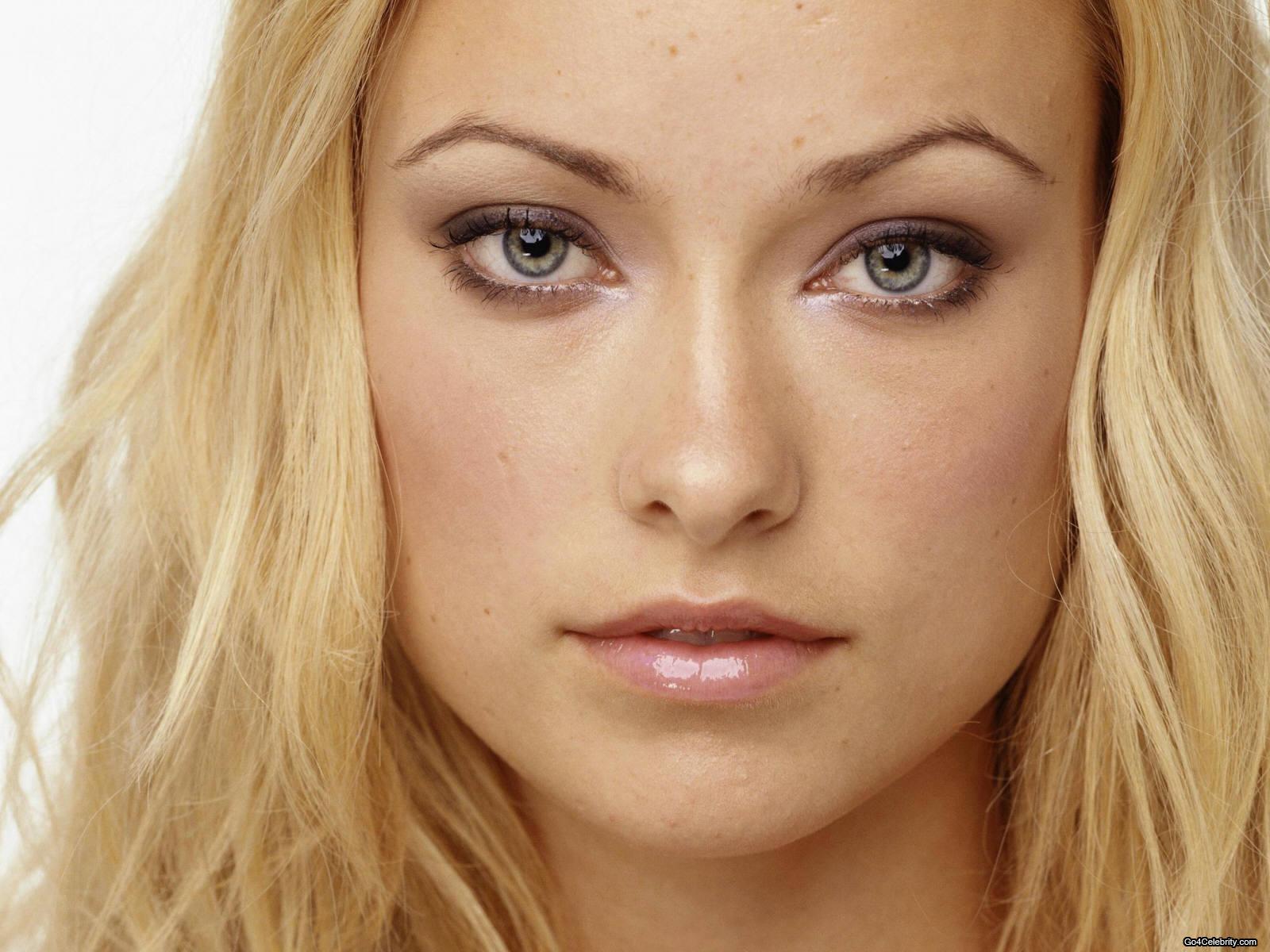
Intro: Photo retouching is one of the most common applications Photoshop is used for. Humans are imperfect as are the photographs we take. Photoshop can be used for retouching techniques such as: red-eye removal, eyebrow trimming, adding volume to eye lashes, removing blemishes/scars/freckles/tattoos, adding makeup, correcting lighting inconsistencies, altering eye color, smoothing skin, whitening teeth, altering hair color, highlighting hair, nose jobs, removing chins, trimming flab, etc. Your assignment is to look at some of the tutorials found here. Using the source photo of Olivia Wilde below, complete as many of the tutorials that are applicable to this image and save them as separate images. Some suggestions include: changing eye color, removing blemishes, trimming eyebrows, enhancing makeup, smoothing skin, etc. Be sure to always show the before and after photos side-by-side.
Retouching Tools:
Retouching Resources:
Other Resources
Exercise 5: Alternate / Extra Credit assignment
Intro: Want a big challenge? Find an old, high-quality damaged photograph and restore it as shown below! Try looking for damaged photos on flickr and http://www.flickr.com/groups/683640@N23/. Be sure to ask permission and credit the owner if necessary in your portfolio!
Next Week's Reading:
Week 4
Lab 1:Title: Advanced Selections & Masking
Introduction: This lab is an extension of the week 2 concept of selections. In this week's assignments you will be utilizing more advanced selection techniques such as the: Quick Select Tool, Magnetic Lasso Tool, Extract Filter, Pen Tool, Quick Masking and applying layer masks. In each of the three exercises, try to utilize a different selection technique in order to get some practice with each. You might want to consider redoing some of the exercises using different techniques to see if you can get a better result with another technique or tool.
Magnetic Lasso Tool
When you use the Magnetic Lasso tool The Magnetic Lasso tool is especially useful for quickly selecting objects with complex edges set against high-contrast backgrounds.
Quick Selection Tool
You can use the Quick Selection tool to quickly “paint” a selection using an adjustable round brush tip. As you drag, the selection expands outward and automatically finds and follows defined edges in the image.
Vector Mask
Vector masks are a technique where you can use a vector path created with the pen tool or shapes tools and use it mask the current layer. Layer > Vector Mask > Current Path.
Extract Filter
The Extract filter provides a sophisticated way to isolate a foreground object and erase its background on a layer. Even objects with wispy, intricate, or undefinable edges may be clipped from their backgrounds with a minimum of manual work. You use tools in the Extract dialog box to specify which part of the image to extract.
Quick Mask
To use Quick Mask mode, start with a selection and then add to or subtract from it to make the mask. You can also create the mask entirely in Quick Mask mode. Color differentiates the protected and unprotected areas. When you leave Quick Mask mode, the unprotected areas become a selection.
Layer Masks
Layer masks use an 8-bit layer to mask layer layers above it. A selection can also be used as a mask.
Exercise 1: (save as VC130_Week4_Exercise1.jpg)
In this exercise you will utilize any of the selection techniques discussed thus far to extract a person from one photograph, and then seamlessly integrate it into another photo using layer masking. You are trying to suspend disbelief as much as possible such that the viewer believes it is plausible that the photo is authentic (though realism isn't necessary). You MUST utilize layer masking in this exercise, therefore you will have to composite a photo int the intermediate zone of the image as seen in the example below (i.e. Sully and Mike are in the intermediate zone between the background and the three women in the foreground.
For example...
Starting image: Normally, a solid background calls for the Magic Wand or Background Eraser, but due to all the edge detail and the fact that I was going to blur the image in the background of the photo, I elected to use the Polygonal Lasso tool. With practice, the Extract Filter can also produce great results for selections around high-detail features such as hair, fur, foliage, etc. However, since the Extract Filter is a destructive technique I avoid using it when I can.
Original Photo
Final Composite - Mostly masking around the earring, shoulder, bare arm and the girl to the left. Areas between Sully and Mike were Clone Stamped in from features in the background.
While this is a more advanced example, it exemplifies the concept of extracting an image from its background (in this case Sully) then placing it in a new image in such a way that it blends naturally. Techniques used include: polygonal lasso tool to cut out Sully and Mike, a layer mask to obscure parts of Sully and Mike behind the women, a Gaussian Blur filter on Sully and Mike to create the image of depth of field, and the Clone Stamp tool to fill in missing detail.
Items discussed in the last two weeks that you should consider as a part of your workflow include:
Another example. Notice that a mask was used to remove the right arm and hip of Master Chief behind the left-most soldier.
Lab 2:Title: Advanced Selections & Masking
Introduction: This lab is an extension of the week 2 concept of selections. In this week's assignments you will be utilizing more advanced selection techniques such as the: Quick Select Tool, Magnetic Lasso Tool, Extract Filter, Quick Masking and applying layer masks.
Exercise 1: (save as VC130_Week4_Exercise2.jpg)
This exercise is identical to Lab 1 except this time you will be following a different theme. In this exercise, you will be taking a small animal and integrating it into another photo such that the animal now looks like a Godzilla-sized monster!
In this example, I did an image search on morguefile.com for lizard and integrated him into the mid-ground using layer masks on the lizard to make him appear behind the street signs, street light, trees and vehicles. The trick to making this shot work is to find a low-angle photo of an animal (it is helpful to find one where you can see the animals legs/arms if possible).
This is a great example of a low-angle photo that can be taken advantage of to make this little guy look like a monster.
Be patient when picking out your scenery. For example, in this photo it would only work if you have a front shot of the animal coming down the street behind the red truck. A side view wouldn't work.
This scene would work better on a higher-angle shot of an animal. Coming from the side-street on the middle-left looks like a prime position for a large KILLER BUNNY!
Masking Resources:
Selection Resources:
Next Week's Reading:
Week 5-6
Project 1:
Title: Implied Motion Poster
Introduction: Design a sports poster. The poster needs to imply a sense of motion associated with the chosen sport.
Course Objectives Tested: Use Adobe Photoshop to create attractive compositions by applying design fundamentals (elements and principles).
Tasks:
You will be applying the following Photoshop concepts in this assignment:
Deliverables and format: A1 poster size (23.4" x 33.1"). The best poster in the class (as selected by your peers) will be plotted out full-size and displayed in the hallway.
Due Date: A draft of your project will be critiqued and graded next week. The completed project will be due in two weeks.
Project 1 Sample:
Inspirational image
Concept sketch using trace from inspirational image. I suggest multiple concept sketches.
Final design. Download the sample Photoshop file here.
Techniques used:
FINAL NOTE: This is the way I represented motion for my composition. I encourage you to find OTHER WAYS to represent motion for yours. I encourage you to search for other ways to imply a sense of motion.
Special Effect Tutorials:
Next Week's Reading:
Week 7
Lab 1:
All of the assignments for this week will involve filling selections and paths with solid colors and gradients based on color harmonies. You will be using the Color Impact software found here and the Colour Lovers website. Photoshop .aco swatch files exported from these applications will need to be copied into the /Presets/Color Swatches sub-directory of Photoshop in order to be used. You will also have to register for a free account at COLOURlovers.com to be able to download the swatches in various formats.
Exercise 1: (save as VC100_Week6_Exercise1.jpg)
In this exercise you will create a 300 x 300 (pixels) image of a single color. The color you select should be based on a color that can be associated with an everyday or commonplace object that evokes a common color in everyone's mind. Do not use objects that are named based on color (e.g. orange). Once you have settled on a word, find photographs of your object (use morguefile.com) and use the Eyedropper Tool (I) to take averages of that color. When you finally settle on a color, write down its RGB values and fill your 300x300 (pixels) square in with that color. Use the Type Tool (T) and place the name of that object at the center of the color swatch (no caps and only using achromatic color). A good solution will be one where the object is recognizable as the color selected by most people viewing it.
Exercise 2: (save as VC130_Week6_Exercise2.jpg)
In this exercise you will create a 300x300 (pixels) image of a 2-color complementary pair. Each color will fill 1/2 of the square divided vertically. Do not tint, shade or tone the hues. To establish an accurate subdivision of space use the "Fixed Size" style option in the Marque Select Tool, or drag a guide to the middle of the composition while holding shift to constrain it. Use Color Impact to create this harmony.
Exercise 3: (save as VC130_Week6_Exercise3.jpg)
In this exercise you will create a 300x300 (pixels) image of a 3-color triadic harmony. Instead of dividing the space equally (like Exercise 2) you will fill three circular selections with each color. The circles should be overlapped in such a manner that none of the background color can be seen in the final image. Apply an equal amount of tinting (white) to each color. Use Color Impact to create this harmony.
NOTE: It is typically not harmonious to tint or shade one hue for than another unless you are creating a monochromatic harmony.
Exercise 4: (save as VC130_Week6_Exercise4.jpg)
Find a five color palette from the Top Palette section of COLOURlovers.com that you find appealing. Recreate this palette as a 750x300 (pixels) image with the colors spaced equally.
Exercise 5: (save as VC130_Week6_Exercise5.jpg)
Find a photograph from morguefile.com that is comprised of three colors that interest you. A good image will be comprised of one dominant, one subdominant and one subordinate color. Open that image in Photoshop and crop it to a 300x300 (pixels) image in such a way that the cropped image still has the three colors in it. Go to Image > Canvas Size and increase the width of the image to 600 pixels. You will have to reposition the image to one side of the canvas. Fill in the remaining half of the canvas with a linear gradient that includes all three colors. Adjust the gradient stops in such a manner that the spacing is equivalent to the proportions of each color in the photo.
Exercise 6: (save as VC130_Week6_Exercise6.jpg)
In this exercise you will create a 300 x 300 (pixels) image comprised of a 4-color analogous harmony. The composition will comprised of nearly vertical overlapping lines created with the Shapes Tool (I). Use varying line thicknesses. It is okay if the white background color shows through. Desaturate three of the colors equally by adding gray to the hue. The third color should be more saturated to create emphasis (in this case the green). Use ColorImpact to create this harmony.
Exercise 7: (save as VC130_Week6_Exercise7.jpg)
In this exercise you will create a 300 x 300 (pixels) image comprised of a 3-color split-compliment harmony. The composition will be comprised of three concentric (all share the same center) circles. The circles should all be centered at the middle of the composition. It is easiest to drag a vertical and horizontal guide to the center while holding down the shift-key to ensure accuracy. The largest circle should fit completely within the composition without any cropping therefore; the white background color will show through in the four corners.
NOTE: Be sure to make the selection for the largest circle slightly smaller on all sides to avoid the flattening of all sides as seen below.
Exercise 8: (save as VC130_Week6_Exercise8.jpg)
In this exercise you will create a 300 x 300 (pixels) image comprised of a 4-color tetradic (rectangular) harmony. The composition will be comprised of four of the same custom shape created with the Shapes Tool (U). NOTE: You are not limited to the default shapes. Different shape libraries can be loaded from the flyout menu. Each of the four identical shapes should vary in size. Apply an equal amount of shading (black) to each color. Use Color Impact to create this harmony.
Exercise 9: (save as VC130_Week6_Exercise9.jpg)
In this exercise you will create a 300 x 300 (pixels) image comprised of a 4-color monochromatic harmony (harmony comprised of a single hue). The composition will be comprised of a random repetition of the word "harmony." Each copy of the word will be the same size, with the same font, with the only variation being to color. Your harmony should be comprised of equal amounts of tinting, shading, or toning (but don't mix tints with tones or shades). Fill the background layer with a compliment of the hue being used in the monochromatic harmony.
Exercise 10: (save as VC130_Week6_Exercise10.jpg)
In this exercise you will create a tileable pattern in both illustrator and then cutting it out for use in Photoshop. You can complete the tutorial Veerle's excellent blog at http://veerle.duoh.com/blog/comments/creating_geometric_patterns_in_illustrator/. You must use a three color harmony (of any type) for this exercise.
Be sure to check out her other awesome tutorials at http://veerle.duoh.com/blog/archive-summary/category/Photoshop-Illustrator. Fill a square area with the new pattern you have created and upload it to Coroflot. I encourage you to use what you have learn to create new patterns as she has some great tutorials on creating all sorts of geometric shapes with Illustrator.
Exercise 11: (save as VC130_Week6_Exercise11.jpg)
In this exercise you will create a sleek Web 2.0 style web page that is ready to be cut out and coded. The tutorial can be found here.
This tutorial gives you a great opportunity to apply the skills you have learned in the above tutorial. There is one major modification that I require. YOU MUST CHOOSE A DIFFERENT TWO COLOR PALETTE THAT WORKS WELL TOGETHER. In this tutorial the author used blue to white gradients. You must choose another contrasting pair that works out equally as well.
Color Resources:
Next Week's Reading:
Week 8
Lab 1:
Worth1000.com posts weekly challenges for Photoshop enthusiasts. Contests from beginner to advanced last a week and the winners are voted up and posted at the conclusion of the project. This week you will be completing one challenge from the archive of past projects found here. Completing more than one entry is considered extra credit.
Prior to choosing a contest check out their gallery of prior outstanding work. Chose a level of difficulty that will challenge you. It is NOT assumed that you will know exactly how to execute a given solution. This is how the best Photoshop users become pros; they are presented with a challenge and devise a solution. There is a tutorial section that you can use that cover techniques used in a variety of previous challenges.
You will be graded on how much it looked like you challenged yourself, your creativity, and how well you executed your solution.
Week 9
Lab1:
Complete the following tutorial:
http://alifelski.com/blog/creating_your_own_organic_textured_backgrounds/
Complete three new textures based on the technique above. Experiment with combinations of Layer Blending.
Lab 2:
Each of the three exercises this week involve manipulating all or some of the colors in a compositional imagine. Permissible typefaces that can be used in this assignment include: Myriad, Helvetica, Trajan.
Exercise 1: (save as VC100_Week7_Exercise1.jpg)
In this exercise you will create a CD cover for a fictitious band. The CD cover must incorporate the following:
The technique you will use to sepia-tone the image involves two steps: first, add a Gradiant Map adjustment layer with the gradient ramp set to black-to-white. This will desaturate your image of all hue. Next, add a "solid color" adjustment layer. Select Pantone 142 (or close to it) as the hue.
Your titling of the CD does not have to be centered, however, the composition must be balanced. Don't accept the default type settings. Adjustments to small caps vs. caps, type size, tracking, leading, and font selection can have an impact on the readability of the type. Make sure that your type stands out from the background (i.e. choice of color, use of vignette, use of drop shadow).
You are not trying to recreate the image below. You solution should be 100% unique.
Bibliography
http://www.photoshopsupport.com/photoshop-cs3/video-tutorials/cs3-non-destructive-editing.html (destructive vs. non-destructive editing) www.adobe.com/designcenter/video_workshop/?id=vid0191 (Illustrator/Photoshop/InDesign integration) http://www.adobe.com/designcenter/video_workshop/?id=vid0059 (Using Live Color in Illustrator) http://www.creativetechs.com/iq/adobe_pen_tool_cheatsheet.html (pen tool cheat sheet) http://justcreativedesign.com/2009/03/04/the-top-100-best-fonts-of-all-time/ http://justcreativedesign.com/2008/03/02/30-best-font-downloads-for-designers/ http://sixrevisions.com/web_design/30-beautifully-textured-web-designs/ http://sixrevisions.com/web_design/20-websites-with-beautiful-typography/ http://sixrevisions.com/photoshop/25-photoshop-tutorials-for-web-designers/ http://www.photoshoplady.com/the-100-most-popular-photoshop-tutorials-2008/ http://sixrevisions.com/graphics-design/35-basic-tutorials-to-get-you-started-with-photoshop/ http://sixrevisions.com/web_design/25-stylish-website-footer-designs/ http://www.makeuseof.com/tag/10-websites-to-make-you-a-photoshop-ninja/ http://sixrevisions.com/category/photoshop/ Surrealist landscapes - http://www.flickr.com/photos/marcoescobedo/show/with/2688473132/ Face composites - http://www.flickr.com/photos/joshsommers/sets/72157594407918871/ Resampling vs. Resizing an image - http://www.photoshopessentials.com/essentials/resizing-vs-resampling.php 80 Text Effect Tutorials - http://www.hongkiat.com/blog/80-best-photoshop-text-effects-tutorials-part-iii/
Shortcut Keys
PSCS3_Keyboard_Shortcuts_PC.pdf PSCS4_Keyboard_Shortcuts_Mac.pdf
|
|
Comments (0)
You don't have permission to comment on this page.